CGPrime app branding
Logo, Play Store identity and in-app visual system for an entertainment app published by RDK Technologies.
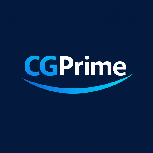
How we branded CGPrime
CGPrime needed a clear entertainment identity before launch — something that felt premium on the Play Store and stayed consistent inside the app. We designed the full brand layer: app icon, store graphics, color palette and UI styling that carries through every screen.
What we delivered
- App logo and icon design for Google Play
- Play Store feature banner and listing visuals
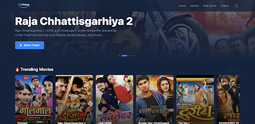
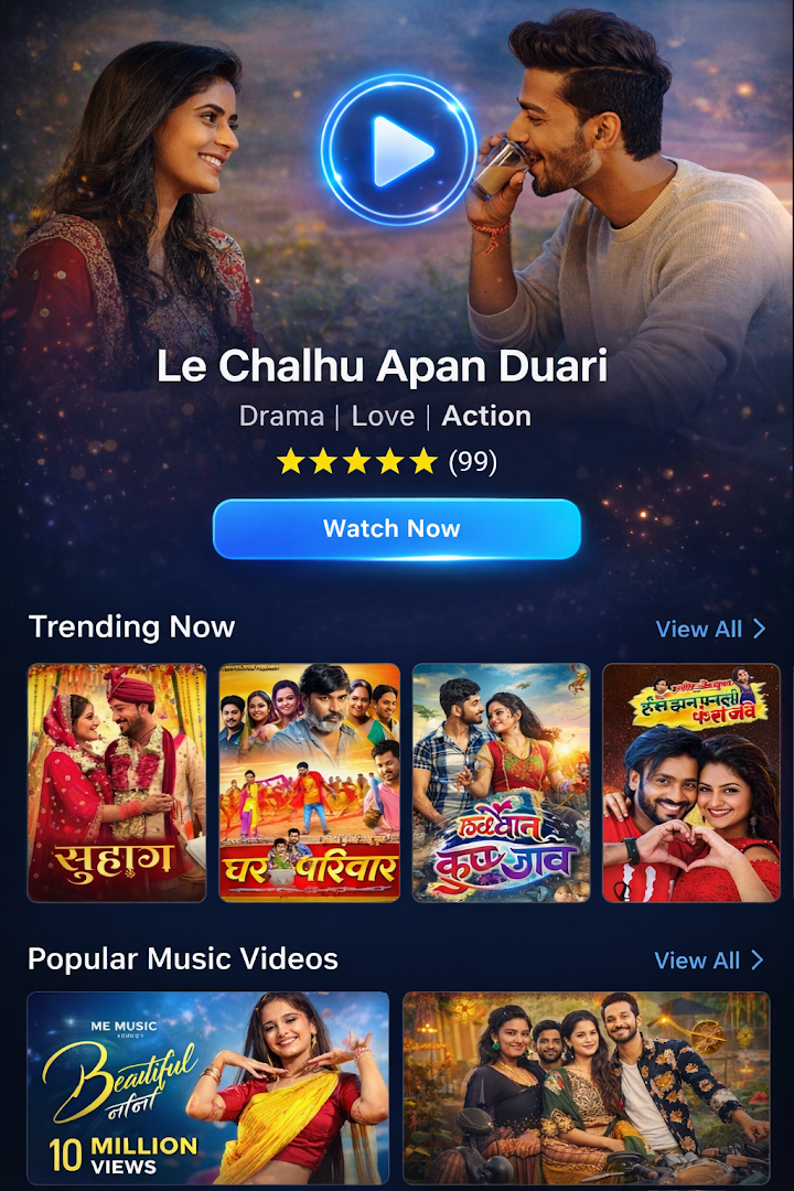
- Dark cinema-style UI theme with accent colors
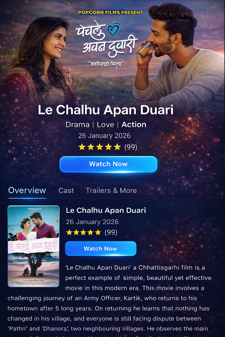
- Typography, card layouts and poster-first browsing patterns
- Consistent brand feel across home, detail and playback screens
Brand approach
We kept the look cinematic and easy to scan — dark backgrounds, bold poster thumbnails and accent highlights that guide the eye to trending titles. The icon needed to read clearly at small sizes on the Play Store, so we focused on a simple mark with strong contrast.
Results
CGPrime launched with a cohesive identity across the store listing and the app itself. The brand reads as a focused entertainment product — not a generic utility app — which helps it stand out in search and screenshots.
Start a branding projectReady to grow your business online?
Tell us about your project. We will reply with a clear plan, timeline and quote.
Get a Quote